- Posted By: admin_designphase
- Comments: 0

Web 2.0 under almost all circumstances implies a new web, something better than that last web. It really means new technologies, but web 2.0 is also applied to web design. Todays web 2.0 websites are written in XHTML/CSS, but even without coding in XHTML/CSS you can still make a web 2.0 website template. So, does this mean this is a new web design? Something newer than the old? Not neccessarily.
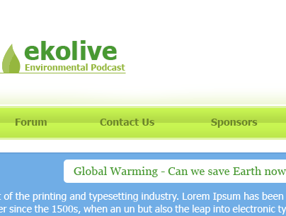
In this tutorial I will show you how to create a web 2.0 website template. Utilizing some of the key features found on most web 2.0 websites. These include whitespace, larger fonts, and personality. We are going to create a simple web 2.0 web site design. This is for a fictious envirnomental podcast website template. Green and blue are going to be the colors used, and we will start off with working on a simple logo for our podcasters, "ekolive".
Creating the Canvas
Creating the size for a web design template can vary, I usually go for 1000px so I can design for the full screen on my resolution. However for this just create a 700px width and 600px height
Creating the logo
Text based web logos are usually very effective. So we will take advantage of its simplicity and ease of creation. Lets imagine that our podcasters were called, "ekolive" and they wanted their tag line to be, "Environmental Podcast" Short and effective. I chose to use the font Tahoma for the font. Create something similar to this:

This is quite simple, so lets add some further effect to it. I like how the text is now, so we won't change any of that. As this is for an environmental podcast lets have a leaf in the logo. Conveniently Photoshop has some shapes for us to use with the Custom Shape tool. Under Nature the 7th shape is of a single leaf. We will use this for the logo. I cut some of the bottom off and sized it up against the logo, and put a 1px line under the logo and attaching to the bottom of the leaf. Making them the same color. Now I copied the leaf layer and used the magic wand tool to select the newly copied leaf. Moving the selection down to the right, until a good size and cut it from the copied leaf. Changing the color too white, and opacity to %25 percent gave it a good effect. It should look something like this:)

Navigation
For the navigation I decided to make a repeating horizontal line for the navigation. Making a 25px height horizontal rectangle about 50px under the logo and give it a gradient and stroke:


The logo and the navigation don't go to well together right now. So, we should utilize another web 2.0 website template effect. Gradient so make a another rectangle above the navigation with a lighter green, and take the rectangle selection tool and give it a feather of 20. Aligning the selection tool accros the top of the green box and press delete until it looks good. Also changing the opacity for a better effect. Looking like this:

