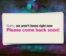
When you are starting a project its nice to have the domain setup, and get some viral buzz about it. Instead of having a boring splash page, you can have a very cool and interesting splash page. This design may not go with your colors for your site, but its principles can be applied. In this tutorial I will assume you have a basic knowledge of photoshop. I will be using some photoshop brushes,...
บทเรียนโฟโต้ชอป
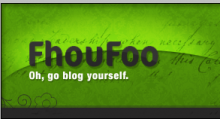
For a blog a banner is usually the only place where one will have some really creative graphical elements. I am going to show you how to create a very cool banner, and how easy it is to do it - with the right tools. Using a few textures, and a few little techniques you can make your boring blog header into something very cool! Blogging is more important to the users, but why not add some cool...
Web 2.0 under almost all circumstances implies a new web, something better than that last web. It really means new technologies, but web 2.0 is also applied to web design. Todays web 2.0 websites are written in XHTML/CSS, but even without coding in XHTML/CSS you can still make a web 2.0 website template. So, does this mean this is a new web design? Something newer than the old? Not neccessarily...
Sometimes we need to create a very interesting logo for a client looking to look outside of the book. This logo brand is not real this is just for show (King’r is nothing, I think?). We are going to be creating the logo above. It is rather simple, and pretty effective. It has the nice modern look, and is very funky.
To get the full effect of this tutorial you must know photoshop at a basic...
Here is another web 2.0 logo design tutorial! Here is another popular style with a shiny box. A good tip with doing web 2.0 designs, and logos is try to keep the shiny/3d/etc effects on one to two elements of the page. Over doing it wont be good for usability and it will make it look very cluttered. There is a general rule to use about one or two shiney elements and leave the rest not...


