- Posted By: admin_designphase
- Comments: 0

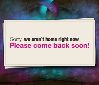
When you are starting a project its nice to have the domain setup, and get some viral buzz about it. Instead of having a boring splash page, you can have a very cool and interesting splash page. This design may not go with your colors for your site, but its principles can be applied. In this tutorial I will assume you have a basic knowledge of photoshop. I will be using some photoshop brushes, you can find good ones any where on the net, but I found the best ones on Deviantart.com.
The texture
Subtle texture can go along way when designing high quality sites. Simple is good on more contextual parts of the site, but for backgrounds its always nice to have a nice subtle repeating pattern. For this tutorial I used a dark brown, and a Photoshop Pattern I got from DeviantArt (Photoshop resources are KEY to good work flow) I encourage you to browse around, and find some nice ones. I also added a bit of grunge with a low opacity to give it some value changes.

Whoa...pretty colors :)
I created a new layer and with some nice grungy brushes I gently placed some neon colors to give the dark background a run for its money. Moreover, high contrast to make the sign we are going to add really pop out. All I did was go around with a brush and click ONCE with a color, and than chose another color and rinse and repeat. I say click once because with grunge and most photoshop brushes if you click and drag you will get some really ugly results.

The notice sign.
Create a new layer, use the rectangle marquee tool, fill it in with white, and in the blending options. Outer glow to a black color, and set to Multiply. Turn down the opacity on the out glow as well. Now to really make it have the 3D feel. Crtl+Click on the layer to select the box, and create a new layer under it, and fill it in with black. This is going to be the stronger shadow. Go to Filters>Blur>Gaussian Blur. Put it on about 2.7 pixels, and this will make it nice and feathery. Move this layer near the right bottom corner of the white box. Try and position it so it looks like that light source is coming from the top left corner.

